Professional projects
As early as my first missions, I have always paid particular attention to the needs of users.From navigation flow to information prioritization, I like to create interesting and easy-to-understand systems.
I love innovation and the intellectual challenge it represents, and I really believe in collective intelligence.
If everyone can have good ideas, my job is to bring them to life the right way. 🌸

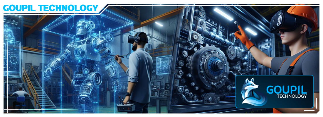 Context: Digital Twins - VR - AR - Industry 4.0 & 5.0 - Lean Management - Project management software, daily briefs (slideshow), ticket management, continuous improvement, Quality-Safety-Environment (QSE)
Goal: Improve Industry 4.0 & 5.0 softwares, make it more usable and pleasing, creating new ways to use the virtual space for training
Missions: Vision - Innovation - Artistic direction - Feature design - UX design - Virtual spatial design - Mock-ups - Prototyping - Interactivity - Readability - Usability
Target: Industrial staff - Learners in training centers - Top Management (for easy and accessible consultation without technical background)
Methods: Agile - Scrum - Design thinking - Co-conception - Moodboards - User testing - Brainstorming - Reports

 Context: Research & Development - Autonomous vehicle decision-making consultation module. [+NDA]
Goal: Allow users to consult/search/modify the vehicle's choices history with a simple and reactive browsing system in order to analyze/modify/validate these choices.
Missions: Recruitment - Vision - Coordination - Mock-ups - Prototyping - Interactivity - Readability - Usability - UX - Features
Target: Internal Ethics Committee - Possible opening to the consultant market in the event of litigation (insurance, investigation service, etc.)
Methods: Agile - Scrum - Design thinking - Co-conception - User testing - Brainstorming - Reports

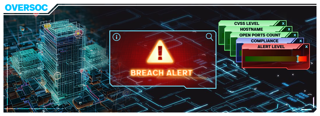 Context: Cybersecurity - 3D visualisation system for businesses' networks, based on video game techniques.
Goal: Ease research work and improve the responsiveness of cybersecurity analysts - Allow the Chief information security officer (CISO) to produce more visually attractive and easily understandable reports.
Missions: Strategic design roadmap - MVP creation - Design & Improvement of the intent prototype - UX - Front dev team coordination - Documentation - Interactive mock-ups
Target: Cybersecurity analysts (for daily use) - CISO (for regular use) - Top Management (for easy and accessible consultation without technical background)
Methods: Project management - Agile - Scrum - Design thinking - Focus group - Co-conception - User testing

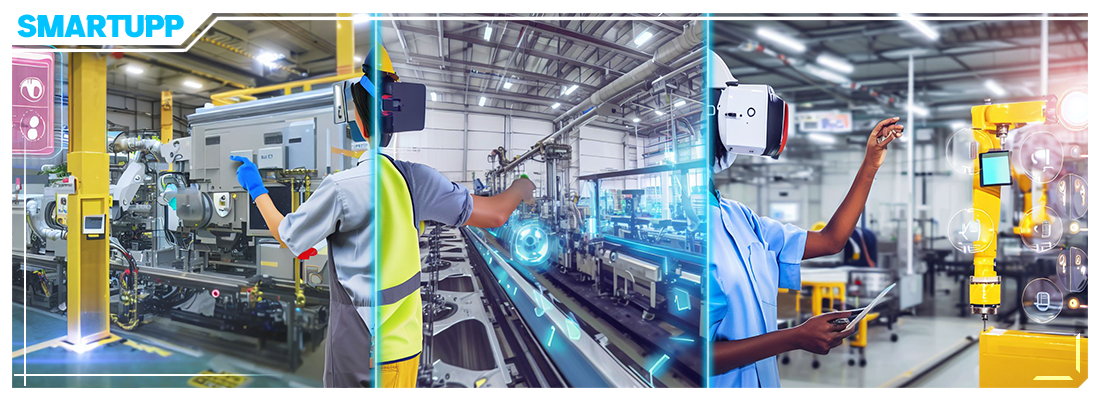 Context: Digital Twins, training and simulation with IRL real-time linking.
Goal: Improve the industrial world transition into the digital by offering modern ways to centralize and consult information, train and use 3D interactive content (Digital Twins and Metaverse).
Missions: UI & UX design on industrial software - Innovation - Graphic redesign - Improvement - Research
Target: Industrial staff - Learners in training centers - Top Management (for easy and accessible consultation without technical background)
Methods: Agile - Scrum - Customers feedbacks - Feature & UX Design - Design thinking - User testing - Collaborative work

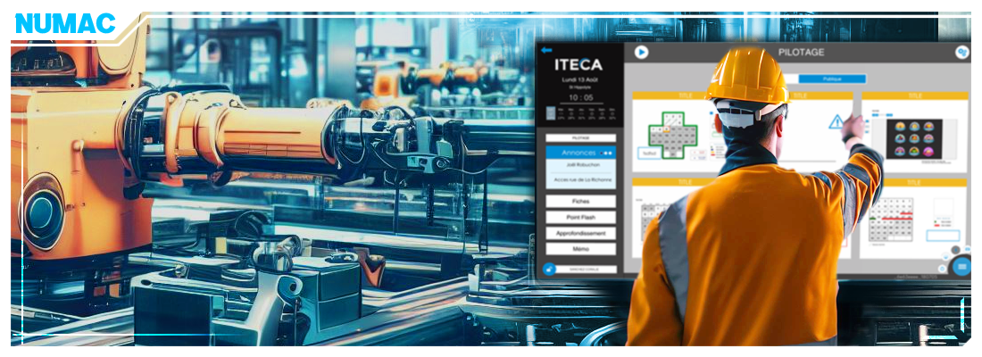 Context: "Lean Management 4.0" - Project management software, daily briefs (slideshow), ticket management, continuous improvement, Quality-Safety-Environment (QSE)
Goal: Improve the industrial world transition into the digital by offering modern ways to centralize and consult information, train and use 3D interactive content (Digital Twins and Metaverse).
Missions: UI & UX design on industrial software - Innovation - Graphic redesign - Improvement - Research
Target: Industrial staff - Managers - Project Managers
Methods: Agile - Scrum - Customers feedbacks - Feature & UX Design - Design thinking - User testing - Collaborative work

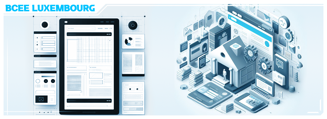 Context: Recurrent support work between 2013 and 2017
Goal: Creation of a "Customer Space" including access to various personal banking services - Variation for a "Business Space" - User journey linked to the services
Missions: UI & UX design for the web - Application of pre-established graphic guidelines - Taking commercial requests into account - Integration into existing systems
Target: Customers
Methods: Conception - Design thinking - Information prioritization - Recommendations - Service contract

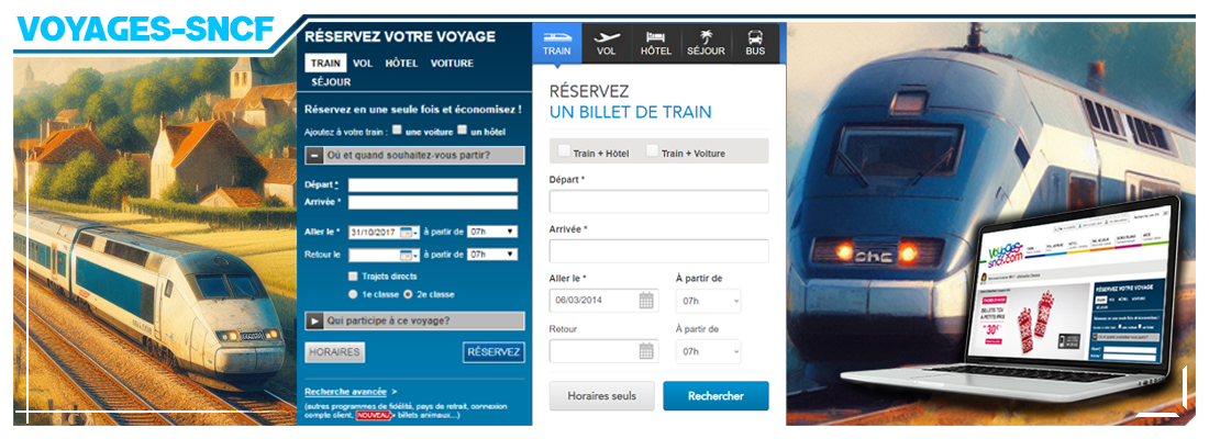 Context: Recurring collaborative services between 2010 and 2015 (tripartite agreement between the parent company, my studio and a full-stack developer partner)
Goal: Design the quick reservation module and the related user journeys - Improve user experience with regular iterations and update according to new graphical charters
Missions: UX design - Web design
Target: Customers-travelers
Methods: Conception - Design Thinking - Customers feedbacks - Collaborative production - Service contract

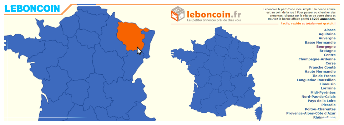 Context: Collaborative design before large-scale launch
Goal: Define a different user experience from the other classified ads websites (especially ebay)
Missions: Highlight the proximity of the search from the first steps on the site - Include the location in the search - Boost the “local newspaper” ad model on a national scale
Final proposal: Arrive on the regions map of France (which has become emblematic) - User journey "A to Z"
Target: Second-hand buyers - Second-hand sellers - Hand bargain hunters - Keyword: Proximity