Presentation & Context
'You would think cybersecurity is about numerous screens and cool 3d networks? Well, it's not. It's Excel.'
The original promise with OverSOC was to enhance the way the analysts and CISO approach tasks,
allowing them to analyse and prioritise threats and events treatment quickly on high volume networks.
With infinite raw data files and only dashboards-based tools, often crafted for a special task,
mental charge and alternating between workspaces are reaching maximum level in very short time periods.
The solution design was focused on two main goals:
1/ Quick lisibility and access:
Any analyst with a little training needs to be able to detect in the blink of an eye where the troubles are located.
A wide range of information would have to be displayed in a few clicks.
2/ Pleasing and easy to share:
Anyone should be able to take a screenshot that remains understandable and expose the reality of the data in CISO reports with a cool 3D view.

Without doing an overall breakdown of all the systems, let's have a look at some of my work:
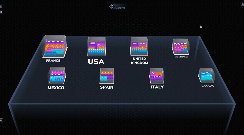
3D network visualisation
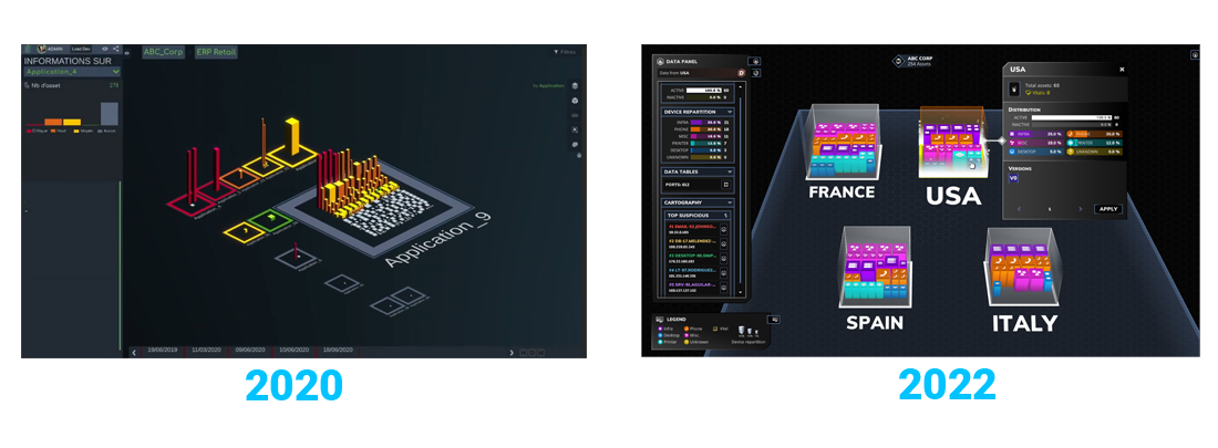
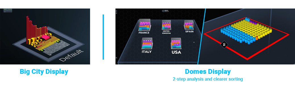
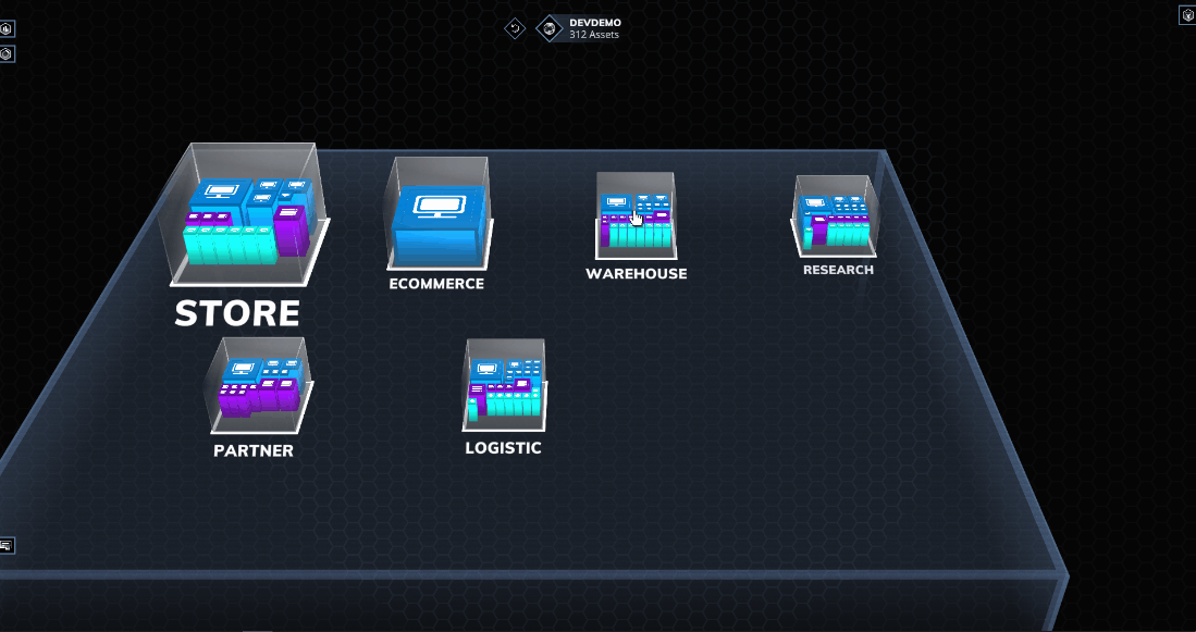
When I joined the project, we were still displaying the networks "Big City" style, which means that all assets were in the same zone, sorted only by filtering. It sure had a great impact for prospection, because nobody ever seen their networks like that before, but it also quickly demonstrated limits.When the CTO and the front dev Lead came to me with technical contraints, we explored a few possibilities and some iterations led us to the domes display method that we all agreed on.
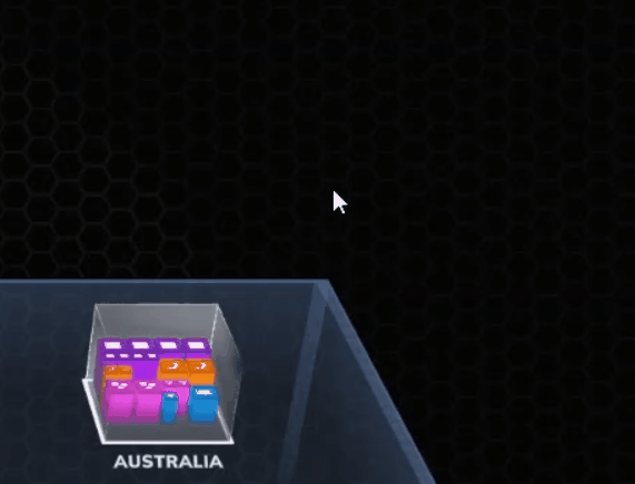
The physical or technical zones are now materialized inside a schematic dome carrying condensed info from the assets inside. The user can then enter the dome to observe a detailed city representation of the inside to consult, isolate and later act on the asset themselves.
Quick actions ⮝
Considering the big amount of assets to display and consult, we needed a ready-to-go solution for the basic, numerous and repetitive actions the user would have to do on those assets. We wanted something always at hand for navigation, actions on assets and even settings access.The choice of a circular menu inspired by popular video games was a must-have to cover a wide range of various actions.

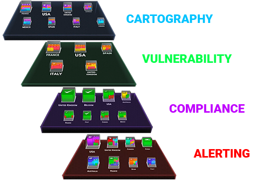
One software (to rule them all) ⮝
Cybersecurity is important. But it's also HUGE.
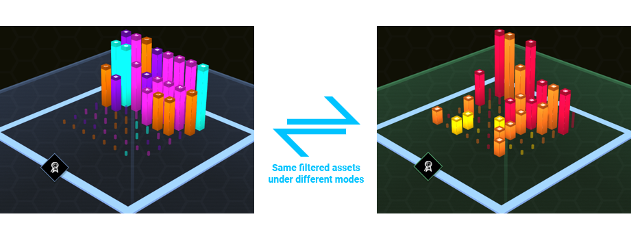
We quickly felt like one solution wouldn't be enough. In order to precisely fit to the needs of analysts and CISOs, but also and mostly in order to keep the software simple, effective and attractive enough, we bet on transversality.As we wanted to display every part of a singular asset, we needed common ground rules for organisation and specific ones for consultation. We therefore created several distinguishable modes with a common grammar to keep user's habits but each of them benefits of a different color context.
Alternate between modes
DYNAMIC FILTERING ⮝
To go deeper into analysis and bring into light assets with anomalies, modes intersect with a dynamic filtering system designed to cover all domains and allow the total transversality.By containing a whole list of criterias in every domain, you can isolate a selection of assets meeting your specifications and even save them as a preset for further consultation.
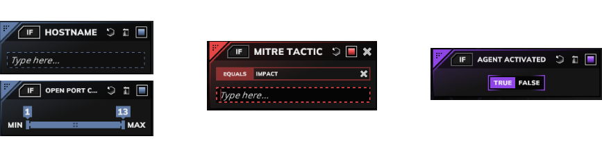
Once the user have set the perfect filters arrangement, the assets will appear sorted and the unconcerned assets will be diminished to increase the clarity of the visualisation.
With the concerned assets, it is easy to switch between modes and see the same configuration under different angles to try and isolate the assets having troubles on other alertness levels.
Users can also save and share presets so standardization within and maybe across companies may be possible.
Contextual UI ⮝
Adaptative panels changing according with context allow us to display maximum information on networks' zones and assets in less than 2 clicks.
We summed up overall information in panels with some graphic elements like pie graphs and assets repartition bar diagrams. The panels allowed us to give access to data tables with a pop-up link but we also worked on relevant interactive tops & flops, opening quick access possibilities and one-asset-only isolation.
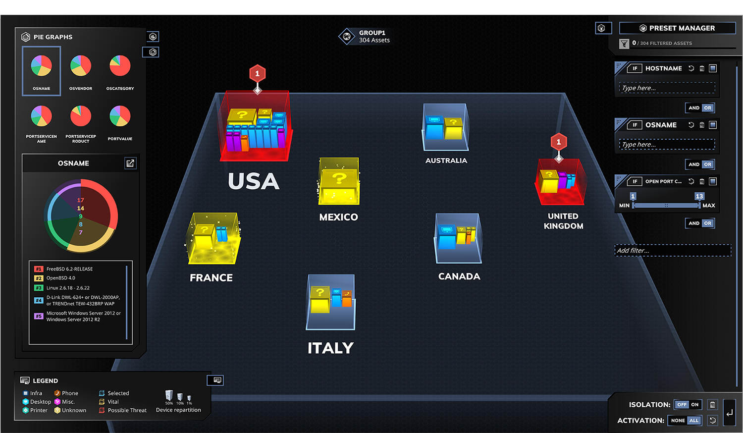
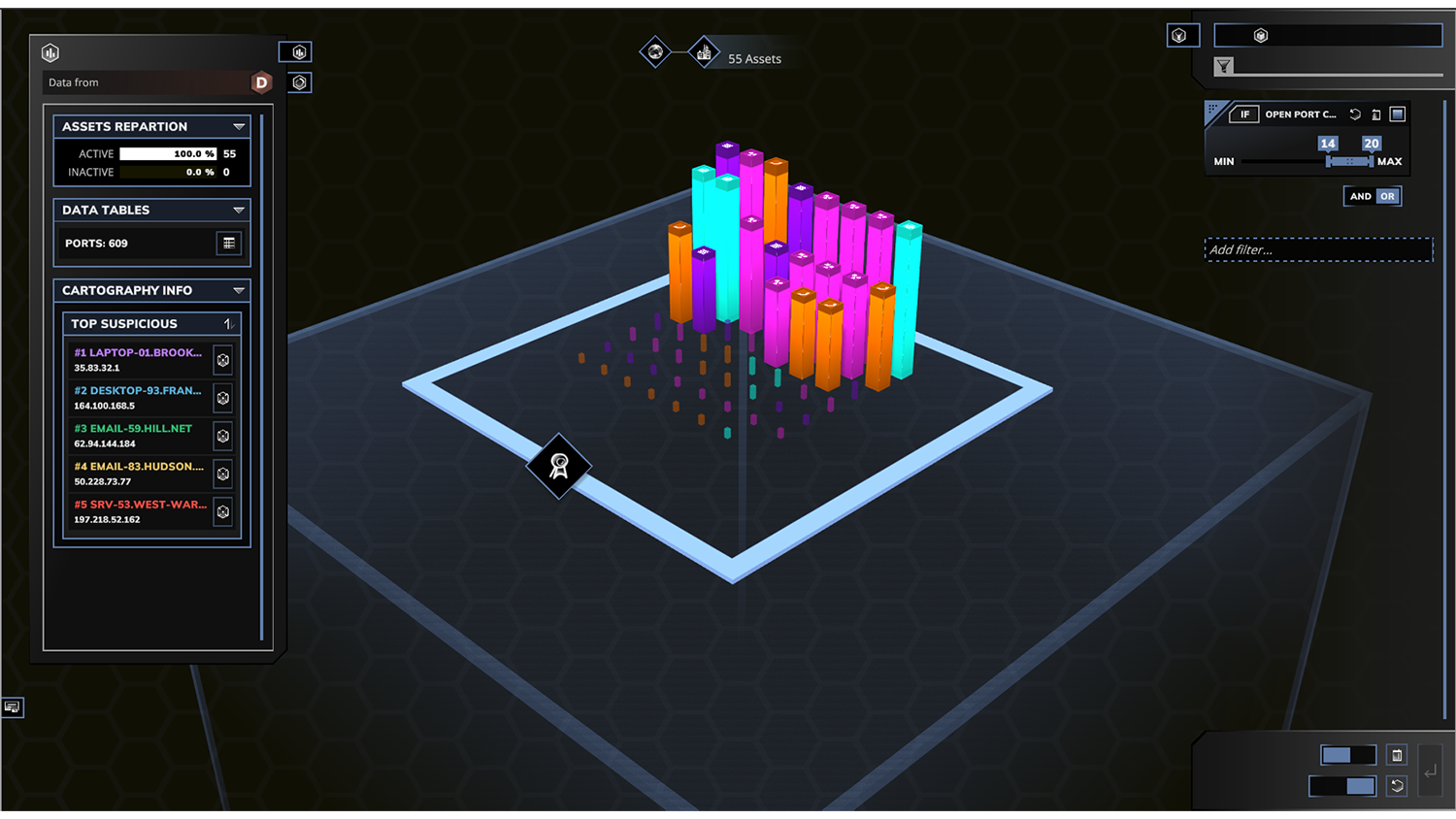
Even more information can be provided with a click on a dome itself as a way to have more details about its content. It also allows the user to compare several domes to facilitate decision making and prioritization.
Reading levels ⮝
Maximizing the variety and the nature of feedbacks by color-coding and layering really helped us multiplying the presence of various information over all dimensions and on different depth levels.